Become math lovers!
Horizontal bar graph
A horizontal bar graph, also called horizontal bar chart, displays the bars horizontally or from left to right.
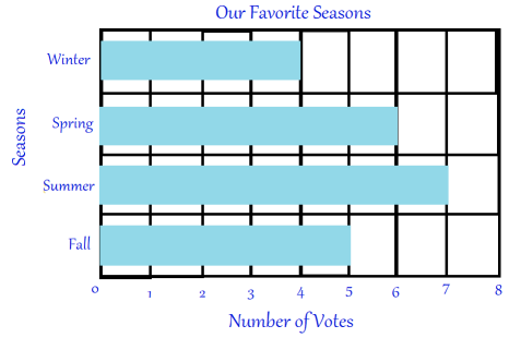
The horizontal bar graph below shows people's favorite seasons of the year.

The vertical axis is used to show the categories or groups being compared. Each bar corresponds to a category and in this case the category is a specific season.
The horizontal axis is used to show the values being measured. The length of each bar corresponds to the value of the season it represents. In this case, the value of the season summer is 7.